Phantasy Star Cave Message Board
Discussions about the Phantasy Star Series - www.pscave.com
PSII fanart: Any colorists here?
27 posts
• Page 1 of 2 • 1, 2
PSII fanart: Any colorists here?
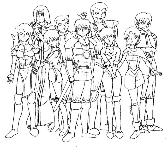
![]() by Mono » Fri Apr 03, 2009 11:45 pm
by Mono » Fri Apr 03, 2009 11:45 pm
Because I have made this, but I don´t dare to ruin it trying by adding colours in my way.
SEGA owes me money!
-

Mono - Scorpius

- Posts: 341
- Joined: Sun Apr 20, 2008 12:20 am
- Location: Rio de Janeiro
![]() by Abominae » Wed Apr 08, 2009 8:31 pm
by Abominae » Wed Apr 08, 2009 8:31 pm
I'll share a technique with you (no, not foi or res) that I used when doing sprite conversions with MS paint (yes, it very well should work with any program)
Cut off a rectangular section of the screen. In fullscreen mode, it should be roughly half the length of your palette. Now, seperate the rectangle into 5 smaller sections going across and numerous other sections going from the top to the bottom of the rectangles.
What you have should look like this:
__________________
__|__|__|__|__|__|__| - Light shade 1
__|__|__|__|__|__|__| - Light shade 2
__|__|__|__|__|__|__| - Default color
__|__|__|__|__|__|__| - Dark shade 2
__|__|__|__|__|__|__| - Dark shade 1
Now, in each third square, going top to bottom. you place a default color of your choosing. Red, Green, Blue, Yellow are excellent starting points, but you will need more than that for anime coloring. Try adding Orange, Violet, Cyan, and two skin tones to the list.
Now, Above, you take the default color and paste shade in two lighter versions of each color and, likewise, two darker shades for the corrisponding color.
You will also need a gray scale for this too. 5 colors (white, light gray, gray, dark gray, and black are what you use for gray scale)
Now, all you are left to do is gather all the rest of the colors you need, find their lighting and shading counterparts and fill in normally. It makes coloring WAY easier on the whole and you can even save your color palette for future use.
For less complicated coloring schemes, cut it down to 3 variations of your chosen colors. you need not delete any information, just cut down from say "1-2-3-4-5" to perhaps "1-3-5" or "2-3-4". Whatever you decide will be best for your needs. And ALWAYS KEEP A FOLDER WITH YOUR UNCOLORED PICTURES AS BACK-UP!!!!!!!! NEVER EVER EVER EVER EVER EVER EVER SAVE OVER ANY OF THEM!!!!!!!
Something I forgot to mention, you should use a dark, almost black, orange color for the border of your palette. An orange that dark is something you'll likely never use.
You can also expand your palette as you see fit, but should never throw away any of the colors you add to it.
Also, only the gray scale should have white and black (not to mention that the other shades should not be so light/dark as to almost be either color)
- Abominae
![]() by LegoMuskCat » Sun Apr 12, 2009 7:12 pm
by LegoMuskCat » Sun Apr 12, 2009 7:12 pm
I like the drawing! Though Nei's hips do look a bit wide. =P
-

LegoMuskCat - Scorpius
- Posts: 435
- Joined: Fri Sep 07, 2007 5:05 am
- Location: US of A


![]() by LegoMuskCat » Tue Apr 14, 2009 8:03 am
by LegoMuskCat » Tue Apr 14, 2009 8:03 am
It's the most noticeable with Nei, though. With all the other females I didn't really notice it as much as I did with her, but maybe that's because she is wearing so little as it stands.thriwren wrote:I think all the female hips are a bit wide for their drawn weight.Tsu wrote:I like the drawing! Though Nei's hips do look a bit wide. =P
I had the feeling, lol.Mono wrote:Influenced by brazilian chicks, I must say :^P
-
LegoMuskCat - Scorpius
- Posts: 435
- Joined: Fri Sep 07, 2007 5:05 am
- Location: US of A
![]() by thriwren » Wed Apr 15, 2009 2:51 pm
by thriwren » Wed Apr 15, 2009 2:51 pm
If they are big on the bottom, I like them big on top. If they are small on the bottom, I like them small on top. I like my women to be proportionate.Zucca wrote:I've always thought that Brazilian chicks look nice. But I don't like too big hips.Mono wrote:Influenced by brazilian chicks, I must say :^P

Thriwren - Lvl 140 - Fortegunner lvl 20
-

thriwren - King Rappy

- Posts: 641
- Joined: Thu Sep 06, 2007 3:55 pm
- Location: Ragol
![]() by Zucca » Wed Apr 15, 2009 3:08 pm
by Zucca » Wed Apr 15, 2009 3:08 pm
Agreed.thriwren wrote:If they are big on the bottom, I like them big on top. If they are small on the bottom, I like them small on top. I like my women to be proportionate.
I am NaN!
-

Zucca - Neifirst

- Posts: 1916
- Joined: Sun Sep 23, 2007 7:06 pm
- Location: Rasi, Kouvola, Finland
![]() by Mono » Tue May 12, 2009 11:03 pm
by Mono » Tue May 12, 2009 11:03 pm
This is the best I can do...
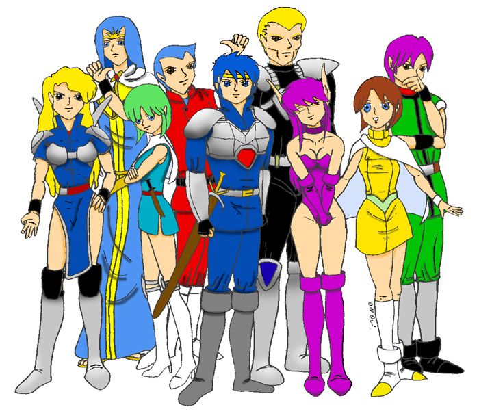
Drawing fine lines to make light and shades and texture is so impossible to me that makes me want revenge against those who can do it.
Drawing fine lines to make light and shades and texture is so impossible to me that makes me want revenge against those who can do it.
SEGA owes me money!
-
Mono - Scorpius
- Posts: 341
- Joined: Sun Apr 20, 2008 12:20 am
- Location: Rio de Janeiro


![]() by Abominae » Thu May 14, 2009 6:05 pm
by Abominae » Thu May 14, 2009 6:05 pm
You've definently got a knack for expressions, which is what I often see most artists leaving out.
One thing I've heard that can dramatically improve your art is tracing.
I've bought myself some tracing paper and have plenty of pencils and pens to get it down... but I'm lacking for anime pics. The best choice is one that's just too hard for me to bother with.
It's the mini poster that came with Izuna 2. I should look at the reversable cover again and see if that'd work. Other than that... it's time to start making prints... which I really don't want to do...
- Abominae
27 posts
• Page 1 of 2 • 1, 2
Who is online
Users browsing this forum: No registered users and 9 guests